Tuesday, 20 October 2015

Production Companies - Deconstruction - Louise Hyam


Deconstruction of Blumhouse productions:

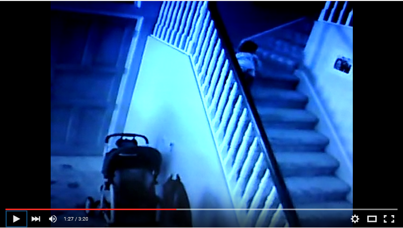
Here is a video of the Blumhouse productions professional company logo and the trailer it has at the beginning of every film that it is used for.
Blumhouse productions is an American Horror movie production company, founded in 2010 by Jason Blum. Blumhouse produces micro and low budget horror movies. Blumhouse produced the Academy Award with a nominated drama film Whiplash for which Jason Blum was nominated the Academy Award for Best Picture.

The genres that Blumhouse produce for are usually horror movies and thriller movies however Blumhouse productions has also produced a few comedy films and also a few drama films. Some of the films that are famous by Blumhouse or have been recently produced by Blumhouse are:

  • Paranormal Activity films - Horror


  • Sinister 1 and Sinister 2 - Horror
  • Insidious


  • The Purge - Horror
  • The Boy Next Door - Thriller
  • The Gift - Thriller
  • Not Safe for Work - Thriller

  • The ToothFairy


  • Best Night Ever - Comedy
  • The Babymakers - Comedy
  • Whiplash - Drama
I think that the Blumhouse production company logo is very effective because of the way at the beginning before the logo comes up there is a girl and we have no idea why she is there and it creates the idea of a horror or thriller film that is about to come so this makes it effective for the genre. I also think the way that the chair fly's around before the writing 'Blumhouse' is introduced is creepy and is something that would be seen in a horror film and by using this as part of the logo for the production company it creates the creepy, eerie effect. The 

School production company deconstruction:

This is the school production company logo that I chose to analyse. This is the logo before the film opening begins:

The film production company logo looks like this:

I think this school made production company logo is very effective. It is effective because of the name used which is 'Shadowless Studios' and the logo and background that are used because of the name used and the fact there is no shadow shown at all in the production company opening sequence. It is also very effective because of how professional it looks the name that they chose sound professional and the logo that they designed is well designed and looks professional.
Although the logo is basic it creates more tension before the film starts because the production company that they have designed doesn't give away any signs of what type of genre the film is going to be majorly, however it does signify it wont be used on a rom - com or films like that but it doesn't specify completely what type of genre this production company would be used for.

The background that they chose is effective because its basic it doesn't draw the viewers attention to that and it keeps the focus on the logo and this is effective because the logo is different so viewers will spend time looking at that.

I think that this school production was made by the making the logo that is in the middle by drawing it onto an editing software on the computer as some kind of design that they made and they did this on a computer so that it would look more professional and not like it has been drawn free hand, they may have used shapes on a designing software to put it altogether. I think that they made it all using photoshop by adding the logo and then also making the background on another editing software so they could make it so it looked scratched. I also think that they then made the title by using photoshop to personalise the typography to be the colour that they wanted and the font that they wanted then they put it altogether then they filmed it so it could be used as a production company.

Wednesday, 14 October 2015

Deconstruction Task - Production Companies

Dark Castle Entertainment


It is an American film production label formed in 1999. The production's name came from a man named William Castle who was a horror filmmaker, so the ambition was for Dark Castle Entertainment to remake his horror films. As it progressed, their own original horror films were created and now there are even different genres made by Dark Castle. 

Here is a video of Dark Castle's company logo and opening which appears before its films:


Since Dark Castle Entertainment’s main genre of film-making is horror, these are some of the most known;
House on Haunted Hill
Gothika
Orphan
The Reaping
Ghost Ship

Additionally, here are some more films of different genres;
The Loft – Thriller
Journey to the Centre of the Earth – Sci-fi
Ninja Assassin – Thriller
Unknown – Action
Whiteout –Thriller


I think the Dark Castle Entertainment’s logo is really effective for the genre because it shows a very creepy looking castle silhouette against a full moon. This is a common theme within many classical horror films, and shows tension and fear during the night time. Before this appears though, thunder clap sounds are used to create the tense and creepy effect of storms. Additionally the lightning bolt that strikes down enhances this and creates a sense of uncertainty for the viewer. 


Furtheremore, the typography used for the title is sans serif, creating a sharp, edgy effect. It is also in a bold font and appears to be slightly smudged and blotchy, again creating a rather chilling feel.


School Made Production 

This is a school-made production logo I analysed:


I think this logo is really effective because it is quite simple but looks very professional. The letters have been edited to fly down in chronological order to create the title ‘Ardleigh Media’ which is probably a play on the students’ names. I thought this was a really good idea as it is a basic effect but it works in making the opening look polished.


The design is a white background, but the added colour makes it look very effective without being too over the top. The colours behind the letters ‘AM’ seem to gently spiral and glow which again is a really well-thought through effect and makes it more interesting.

I like the way it is a very basic but professional looking design, and it is unclear what to expect next as it does not give away much, creating anticipation. I think this logo was probably made through the use of different lighting to create a shiny surfaced look.


Tuesday, 13 October 2015

Se7en - Titles Effectiveness for Genre

The opening credits of Se7en are all very effective, particularly through the editing techniques. The words only appear for a very short time before disappearing and flicker slightly, creating a sense of mystery. The titles have also been edited to blur and overlap into each other at some points which is again really effective, building up suspense.


Throughout the opening credits there are also many features which link to a psychological horror in the background of the titles. For example, there is a shot of a Bible which is a very common religious theme in many psychological horrors, with references to ‘God.’ This suggests that religion is significant within the film and may foreshadow what the viewers have to come. There is also a lot of mystery created focusing one character where their hands and fingernails are used. A particular shot shows a blade being used to peel off skin, suggesting the character is trying to hide their identity. This again creates an idea of what is to come further on in the film and leaves the viewers curious.


The typography used for the titles is sans serif, making the letters look sharp and edgy. It is also in a font which appears to look old or written using a typewriter. This creates the tense and mysterious idea of the film to come. 

Lastly, throughout the opening credits a very jumpy soundtrack is played which is effective in creating tension and building suspense. The music fits really well with the flickering titles which flash in, making the entire opening very edgy and jumpy.


Se7en Opening Titles Deconstruction

Se7en

I deconstructed the opening titles of the show 'Se7en' and placed them in a timeline of chronological order.


The purpose of this task was to understand the use of opening titles in a film and how they play an important role in a film. It showed me different ideas of how to present titles and how they can be very effective to suit a genre. I also learnt that the scenes in which titles appear are an important aspect too, and the mise-en-scene in these can either create suspense or foreshadow what the film is about or what is coming.

Opening Titles Effectiveness for Genre

 
Effectiveness for genre:
 
At the beginning of the opening titles of Se7en the effectiveness of the genre of a psychological horror is shown when there is a shot of someone committing a crime shown by the use of a razor or a sharp item. However the camera shot just shows the hands of the person committing the crime and this happens throughout the opening titles. The reason that this is done is to protect the identity and the facial characteristics of the criminal so that they cannot be identified just from watching the opening titles and just show close up shots of either the weapon or the hands or the crime happening. This is done so that it doesn't give anything away in the film, the reason that in the opening titles they don't give anything away is so that the audience who view this will be more intrigued for the film  and it will keep the audience unsure of who it is as in the opening titles the faces of peoples committing crimes are never shown. This is shown in the below screenshot the use of weapons also helps to show the genre of a psychological horror because it shows that people commit crimes and the mise-en-scene used in the opening titles helps to portray this.
 
 
The way that the opening titles of Se7en are introduced helps to link with the film and the fact that it is a psychological horror. In the opening titles there is a lot of religious links that are made through the use of the titles and the photography and backgrounds behind the opening titles. One of the ways that the religious links are shown is through majorly in the opening titles is the really close up shots of the Bible when introducing the opening titles when sections of the Bible are being highlighted. The use of religion in the opening titles suggests that religion is a huge link within the film with things such as the 7 deadly sins being a huge thing shown within the opening credits and there is a lot of reference to 'God' in the opening titles from the Bible. These things being focused on in the opening titles are suggesting that these could be significant within the film and that religion plays a role in the film so it helps to give away part of the background information of the film. This is shown in the picture below when there is a reference to 'God' as part of the opening titles:


The opening titles of Se7en are made to be effective and show the idea of a psychological horror all of the way through the opening titles because of the editing that is used. The titles are not shown for very long and they are shown very short and quickly which just from seeing the titles creates a jumpy effect as they change very quickly. Also another way that editing is used effectively throughout the opening titles is that the way the titles overlap and show a blurry quick synopsis of scenes from the film which gives some of the film away to the viewer already through the opening titles.

Also the opening titles are showed very quickly which shows a sense of mysteriousness as the viewer of the opening titles of Se7en does not get revealed very much due to the editing as the titles don't last long and the faces of people are never given away it is only ever the weapon used. Below is a screenshot of an example when the audience don't get shown for very long the names and when they are edited and all blurred on the screen with other edited features such as lines added onto the opening titles and there is also a shadowing effect of the colour of the names presented next to the names, this helps to present the genre as it shows a sense of uneasiness and that there is blurry sense to the film and this could conform to a psychological horror because it plays on the audiences mind.

 
The way that the opening titles are introduced through the use of typography is different because the typography used already shows that the film is going to be edgy because of the cut unfinished edges on the opening titles and the typography is sans serif which shows the idea of things being unorganised and creates a mystery for the film. This is shown in the screenshot below:


The opening titles also introduce some of the titles with pictures behind them as part of the typography for some of this these go with the opening titles that are coming up and give away part of the film at a short quick glance and some of the stuff that comes up behind the opening titles is eerie and this will create the same effect for the film.

Opening Titles Genre Effectiveness - Se7en

I think that the Opening Credits at the beginning of Se7en are effective throughout. One way in which I think that credits are effective is through the editing. The opening credits have been edited in a way to make them very quick and choppy so not much can be seen. This gives mystery throughout the first scenes as you can only see snippets of everything happening and makes it tense from the very start. The titles have also been edited so that certain scenes overlap each other and look transparent so two different scenes can be seen at the same time. One example when this was seen was when words were being crossed out and an overlay on top of this shot shows the words which couldn't be seen. This gives the viewer as hint on what the film may be about before it begins.

Another way in which the opening credits for this film is effective is with the choice of typography. There has been a use of a Serif font in the opening titles which creates an older and more ragged looking feel to the movie. It also suggests that the film is eerie and tense as the typography is uneven and made to look as though it has been warn away and scratched at. The typography is also effective as its look also fits with shots in the background relating to religion and obsessions which are highlighted to be in the film making it appropriate for the genre of film.

There is also a lot of links made to religion throughout the opening titles. This is shown through the close up shots of the Bible, with sections being highlighted, crossed out and cut before being added to another book. Words such as 'God' and quotes relating to the 7 deadly sins are cut out and kept suggesting that an obsession with Religion is one of the main focuses of the film. This relates to the film genre as Psychological Horrors are often based on an obsession of some sort which is focused on throughout the whole film as the serial killer uses it as his main focus in his crimes.

Finally, the opening scenes are effective as the shots ensure that the identity of the person committing all the crimes is well hidden, so to not give away anything at the beginning of the film. This creates mystery as we see close ups of the characters hands and fingernails but not their face as we are unaware who has the obsession and why.. This is also made more effective by the extreme close up of the character using a blade to peel off his skin and fingerprints suggesting that the character commits crimes and is going to extreme measures to hide his identity and ensure that he doesn't get caught.

Monday, 12 October 2015

Opening Titles Timeline - Se7en - Louise Hyam

Timeline for the opening titles of Se7en:
The purpose of this task was to print screen every time someone's name came up in the opening titles of Se7en and also print screen any mise-en-scene that was interesting. What I did was I had to watch the opening titles all the way through so that I could work out what the genre was then each name I either print screened the name or the mise-en-scene and added it to my timeline and then I either wrote what was interesting about it for the mise-en-scene or about the typography or I either wrote about the names of people that were coming up and why.

Things that I have learnt from doing this task is that the genre can be portrayed very easily through the write use of mise-en-scene and the write use of typography. I have learnt that also the opening titles would be very boring if they had no background to them and if the typography as boring as a lot of the genre of the opening titles is portrayed through that.


Opening Titles Credits Timeline - Se7en

For this blog post I made a timeline for the Opening Credits for the film Se7en. The purpose of this was to look at how often the credits came up and to allow me to look further into the type of fonts used for the typography. It also allowed me to look at the shots and scenes that were included behind the text and how it made it more effective and stand out more.

Here is a timeline of the Opening Credits for the film Se7en:

From doing this timeline I learn that a lot goes into the Opening Credits of a film and that when deciding whether to create an opening scene or opening credits for my coursework, there is a lot that needs to be considered, such as the font used, the music, the shots and scenes and the editing to put it all together. I will use this timeline as a guide on how opening credits should be presented and edited.

Sunday, 11 October 2015

Deconstruction of Paranormal Acitvity 2


Deconstruction of film opening scene: Paranormal Activity 2

Genre: Horror

Effectiveness: (camera angles, editing, sound, mise-en-scene):

The effectiveness of the supernatural horror that is portrayed in Paranormal Activity 2 is portrayed through many different techniques below are some of the main ones that help convey the genre of horror.

In the opening scene the sounds at the very beginning it starts of silent with non-diegetic sound of a camera recording and silence and then after a while of silence a baby crying which automatically signifies that something is happening. Diegetic sound of footsteps is used when the different rooms are being shown towards the beginning of the first scene, the diegetic sound of footprints makes the viewer think that there is someone in there but the viewer cannot see anything they can only assume through the use of diegetic sound.

The lighting that is used throughout the first scene at the beginning is very blue dark tone and this creates the idea of horror because it is different to lighting used in other films and it creates an eerie effect because it is dark creates a lot of shadow in the corners of the rooms shown in the blow screenshot from the first scene of paranormal activity 2.
 
 
The mise-en-scene in this is usually what is shown in a horror film the living room is shown in the first room and this conforms to common representations of horror films because horror films always show usual home like situations so that the viewers will relate and this will make them feel uncomfortable. This is done in paranormal activity as shown in the below screenshot when they show their family living room with everything that is expected to be in a family living room e.g. a family dining table, sofa, chairs, and a baby’s highchair.


The camera angle used here is a high angle where the camera is looking down upon the baby going up the stairs shown in the above screenshot. This shows that the baby is in danger and from this being in the first scene the viewers see the baby as one of the victims. This is shown in the above picture.
In the first scene of Paranormal Activity 2 there is lots of cuts when it is showing the different room it jumps quickly from one room to another and eventually takes us to the baby’s room where this leads to tension for the viewers and the fast movement up to then builds them up for this.
One of the editing techniques that I used is a cross fade where the first shot shown below emerges into the second shot shown below. This happens quickly and is unexpected. This in paranormal activity in the first scene could show that there is something about to happen in a different location that the viewers need to see. A cross fade shows a change in location in paranormal activity.


Fake Wounds Practical Task


Practical Task – Fake wounds/bruises
I got my inspiration of doing fake wounds and bruises form horror films and I went on YouTube to look for inspiration further on there in order for me to be able to do my own practical on fake wounds/bruises. I used this video off of YouTube below for inspiration. This video showed me what it looked like and showed me how to do it as a step by step procedure.


What I did:

Firstly I applied foundation to a hand in a small area to use as base before adding everything else I needed to add to the hand. 


Secondly I put glue onto the hand to act as raised skin and add the effect of broken skin and skin being raised. I also got my inspiration of using glue to make it look like broken skin as when I watched the YouTube video the dried glue was used to act as broken skin.
 
 
After this I added facial powder over this to attempt to make it look skin coloured.


After that I added concealer on top of the facial powder for the same effect to blend the glue into skin colour.


 Then after doing that I added blusher into the whole I had created in the middle of the skin to create the idea of red bruising in the middle of the open raised skin.


After that I added black pencil eyeliner over the top of the blusher to make it looked bruised and to add to the colour of the red bruising.


Then after that I added brown and black eye shadow on the surrounding area of the wound to create the idea of bruising and pain surrounding the wound.


After that I used red lipstick to add into the whole of the wound where the red blusher is to look like blood and make it look like the wound was bleeding.


Finally I used lip-gloss to add around the wound to represent puss and pain surrounding the wound.


 Final product:


  Evaluation:

As I was time constrained I obviously didn’t have enough time to buy all the products I needed so I used most of the makeup I had at home so this impacted my final result. If I was going to do this again I would change some of the makeup pieces I used for different things for example changing red lipstick to represent blood to using fake blood so it looked more like blood inside the wound and this would make it look more gory and more real.

Saturday, 10 October 2015

Practical Task - Fake Wounds

To begin my practical task I first went on Youtube to look for inspiration and found this video tutorial on how to make fake cuts and wounds and used it to help me:


The first thing I did was collect all the equipment I needed to create the fake cuts. These were scissors, fake blood, scar wax, foundation, lipstick, eyeshadow, sponges and brushes.

Step 1:
I began by placing a small piece of scar wax across the hand  and blending it into the skin so there were no lines where it was added. I made sure that I didn't use too much wax so that it was as flat to the skin as possible so it wasn't raised from the skin too much.
Step 2:
I then used the scissors to make a cut in the scar wax. I used the scissors to open the wound to ensure that I could add the blood and colour to it easier later on.

Step 3:
I then added a foundation of the same colour as the skin to make hide the scar wax and blended it in to make it look more life like and realistic.

Step 4:
I then used a small brush to add a dark lipstick to the inside of the cut made earlier. This will create a dark base for the fake blood which will be added later on.

Step 5:
I then used a fluffy brush to add a dark red eyeshadow to the skin in and around the cut to make it look irritated and slightly bruised, this also helped to hide where the foundation hadn't covered the scar wax very well and added contrast to the skin.

Step 6:
I then used a brush to add fake blood to the inside of the cut, this enabled me to add it precisely and ensure that I had reached all the cracks and indents in the scar wax.

Step 7:
I then used a sponge to add more fake blood in and around the fake cut, to make the wound look more realistic and messy as if it was a real cut.

Evaluation:
I think that this Practical Task was successful as I was able to create realistic wounds using the video tutorial found on Youtube by using the materials and techniques in the same way but on the hand instead of the face. I think I was successful in using the brushes and sponges when adding the foundation and make up to add just the right amount colour to the wound to make it look life like so it wasn't too dark and unrealistic. 
However, if I was to complete this task again I think I would use a different substance as the fake blood as it was quite bright and red and didn't look real when first added. I would also add some more lipstick to the wound to make it a darker red which may also make it look more life like. I also think I would improve how I added the foundation as when added it looked patchy where it was put on top of the scar wax, but I managed to cover this up later on when I added the fake blood around the wound.

Deconstruction Task - Woman in Black

This is the Woman in Black opening scene:
 

Woman in Black is a supernatural horror film. The opening scene of the film begins with a scene of a group of young girls playing, a diegetic soundtrack has been used as the scene begins which is eerie, creepy and slow with the use of strings. This is effective as it immediately creates tension and suspense in the opening scene as the slow music doesn't fit with the scene of the young girls playing with their dolls, which makes the viewer realise that this is not a 'normal' situation as the only sound used is the slow music, which sounds like a set of bells, wind up toy or nursery rhyme made to sound scary and to help build tension.. There is very little diegetic sound in this scene as the music is the main focus, however diegetic sound is used when the children get up and walk over their toys, crushing them and a scream can also be heard once the children have jumped out of the window, making the scene tense and eerie.


The is a wide range of different camera angles used in the opening scene which are effective throughout. At the beginning there are a variety of different close up shots showing the girls dolls and toys whilst they play with them. A mid shot is also used to show the girls smiling and playing together showing their facial expressions to show that they are enjoying themselves as 'normal' girls would, despite the eerie music suggesting otherwise. There is also a use of a long establishing high angle shot to show the girls in what looks like a playroom surrounded by their toys. The use of a high angle shots makes the children seem vulnerable and small as if they were in danger or being watched making the scene seem tense.


The editing in the opening scene is very effective as it has been slowed down so that it works well with the slow music being played. The children are filmed looking up at the camera as if someone was standing there, this them cuts to them turning their heads to look at the window next to them and a shot of the window is shown. The use of this editing to make the girls move and play in slow motion is effective as it adds suspense to the opening scene. Match on action is also used in the opening scene as the three girls stand up together and walk towards the window, match on action is used as close ups are shown of the girls hands and feet as they stop what they are doing and stand up, which continues as the girls are seen walking towards the window towards and away from the camera and open the windows and stand up onto the window ledge before jumping.


The mise-en-scene in the opening scene is very detailed as the film was set in the Edwardian Era. Close detail to the props and surroundings is shown in the opening scene as the children have a tea party in the attic surrounded by Edwardian toys such as china dolls and old fashioned pushchairs and rocking horses. The style of the furniture in the attic also suggests that it is set in the Edwardian Era as well as the close attention paid to the girls outfits which was common in this Era. All this put together creates a scene which shows the time in which the film was set and also helps to make the opening scene scarier as toys used in the film such as china dolls are often seen as creepy.